- The type of membership product you’re creating — is it a single, standalone product, or will it ultimately be a combination of multiple membership products?
- Your topic area and any considerations to keep in mind there
- Your target audience, and the specific colors, imagery, or messaging that appeals to them
- And your pricing — if you’re creating an expensive and comprehensive membership, you might want to create a logo that you can use on all the materials associated with it; whereas you might not need that level of detail for a smaller offering
Choose a name
The first step in branding is choosing a name! You may have one in mind already, but if you don’t, here are some tips for naming your product:
Start by brainstorming without judgement. Just write down whatever comes to mind, including simply words that are in your topic area. At this point anything goes, we’ll cross out later!
Consider your target audience and the language they actually use. Incorporate terms they’ll recognize and connect with.
Try to craft a transformation with your name, if possible. If your name can clearly express what people will get out of your membership, and how they’ll be better off because of it, that’s ideal.
- Does it clearly infer what your membership is about?
- Does it match the tone of your membership? You’ll want to toss out names that are too playful for a more professional membership, or too serious or bland for a more lighthearted membership.
- Is it available? If you want to trademark the name, there are different legal considerations you’ll need to make. But even without that, it’s good practice to do a quick search to determine if someone else is already using the name or something very similar to it.
- How well does it fit with your brand name? You’ll likely be saying or writing them next to each other quite a bit. Make sure they work together and flow well!
- And, in the same vein, can you say the name over and over again easily? If it ends up being a tongue twister, it might not be the best fit.
Plan your URL
Because your membership product will be sold online, you’ll of course need a home for it on your website.
It’s possible to create a new website specifically for your membership, but you certainly don’t have to (and it’s not advisable unless it’s a massive membership that you anticipate will take on a life above and beyond your business name).
Just ensure you have a reasonable URL slug in mind for your program. For example, this course is memberspace.com/courses/membershipmax. That’s the name of the course, and that’s where people can go to learn about it and enroll.
You can choose essentially anything for your URL slug, but you’ll want to keep it simple and easy to remember, as well as closely related to your membership name.
If your membership name is How to Start a Successful Travel Blog on a Small Budget — that’s pretty long and not user-friendly on a keyboard, so you may want to choose a simpler URL slug, like /travel-blog-training.
Build your branding
Logo
You don’t have to create a logo for your membership product, but you can. It can be a good idea for larger or more expensive products because it can help to professionalize your product and tie together different aspects of it. For example, the Membership MAX! logo is on our website, slides, handouts — it’s used in a bunch of places to confirm that this is all part of and referring to the same course.
Canva is a great design tool to use for creating a logo. They have a free plan that’s perfectly sufficient for many small business owners. They also have thousands of templates, so you can easily create your own professional-looking logo without hiring a graphic designer — a huge benefit for a lot of small businesses.
Colors
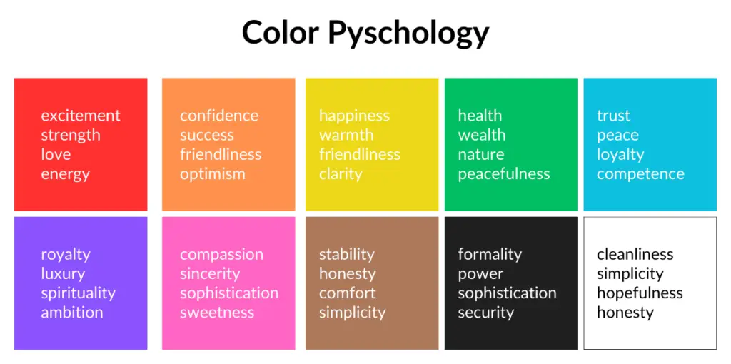
When choosing your brand colors, you’ll want to document and save your color codes, which are specific alphanumeric codes that tell computers how to properly display the color. We’ll work with Hex codes, which are made up of six characters following a pound sign. For example, #000000 is black, and #C63882 is the color of the hyperlinks on this page.
Useful tools for choosing your brand colors:

Fonts

- In general, it’s best to stick to just 2 fonts, 3 at the most.
- Having some differentiation of font, whether using a different font, or different styling in the same font, is helpful to break up text and provide emphasis throughout your materials.
- However, you don’t want to go crazy, it’s best to use as few font variations as possible to accomplish this.
- Just like color, keep in mind the psychology of fonts and how they influence the way a prospective customer sees your brand. If you’re a financial advisor, you might want to choose a bolder, more stable font to symbolize security. If you’re developing a membership about finding balance as a new mom, you might want to choose something that feels calming and uplifting.
- And, if you have existing branding, it’s a good idea to include at least one common font for consistency.
Continue Module 2
