A smooth signup experience is essential for growing a thriving business. That’s why we’ve improved the plan selection display and payment form shown on your website. These changes make it easier for your members to view, compare, and join your plans—while providing you with a sleek, modern experience to showcase your offerings.
Plan selection display
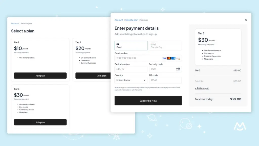
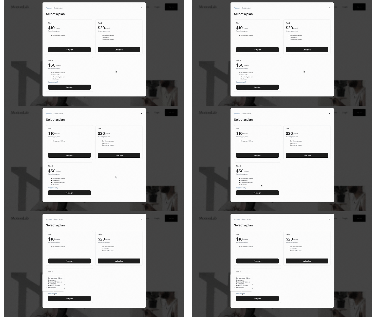
The plan selection display now features a sleek grid view, replacing the old dropdown. This streamlined layout allows members to see all of your public plans at a glance, making it easier to compare options and choose the best fit.
Each plan option now displays its price and description directly in the grid. For longer descriptions (300+ characters), members can hover over the Read more tooltip to view the full text.
- Via your All-Plans Link
- By clicking the “Join new plan” button in a member’s account area
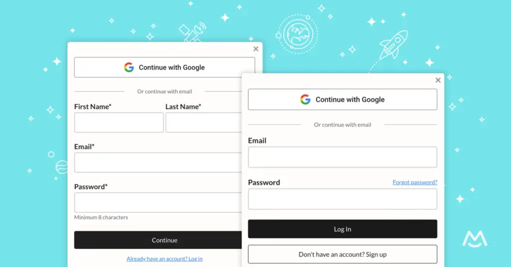
- If you’ve enabled the signup option within your login form and configured it to allow customers to choose from your public plans
✨ Offering multiple plans? Add clear, concise plan descriptions to highlight key features or perks and help members make an informed choice.
Keep your plan options simple—too many choices can lead to decision paralysis (and fewer signups!).
Redesigned payment form
We’ve also reimagined the payment form for a more modern, intuitive experience that simplifies the checkout process and helps members sign up with confidence.
The new layout places payment fields and method options (like Apple Pay and Google Pay) on the left, while detailed plan information and a clear breakdown of charges are displayed on the right.
This breakdown includes everything members need to know: the plan price, any applicable credits or discounts, signup fees, and taxes, as well as helpful notes about their plan changes—like which plan they’re leaving and joining if they’re upgrading or downgrading.
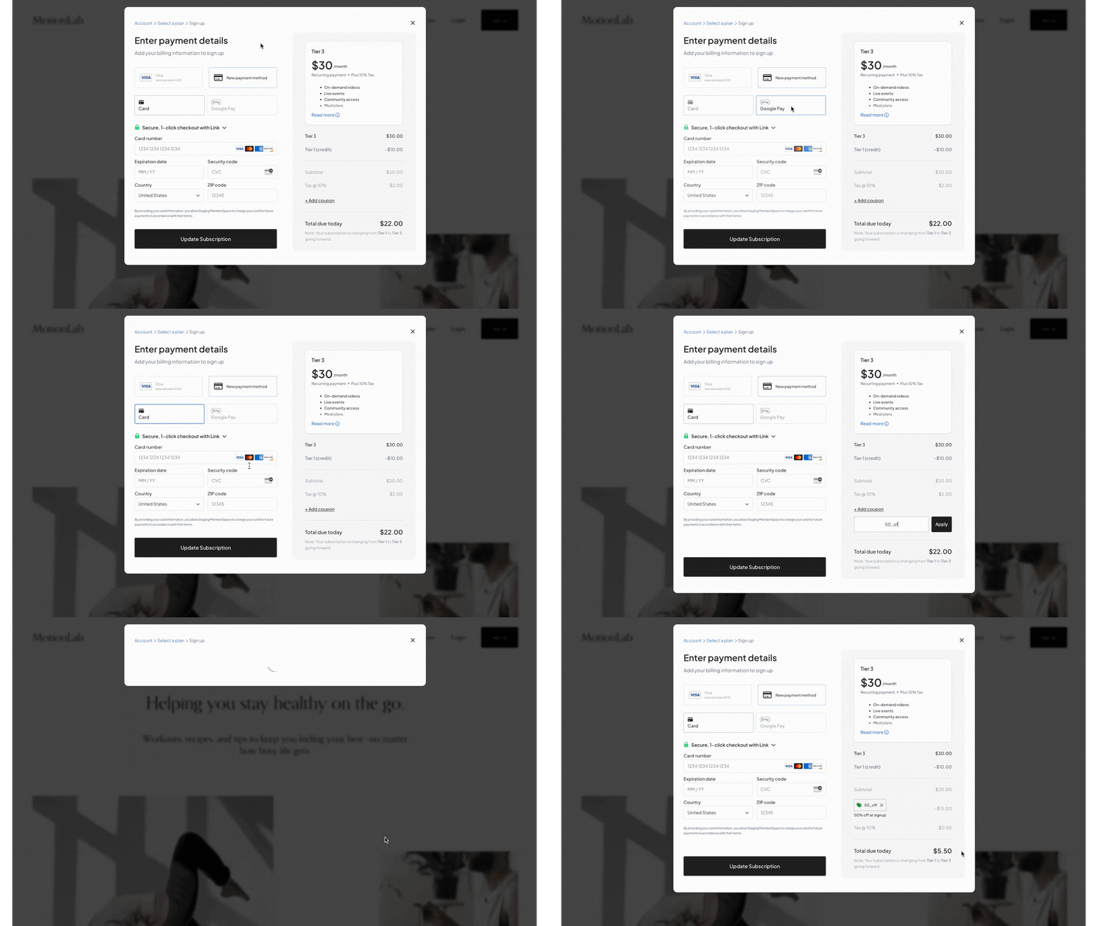
This updated layout ensures members can review the details they need before completing their signup—making the process smoother and more transparent.
We hope these updates make it easier for your members to compare plans and understand their charges—while giving you a cleaner, more professional way to showcase your pricing and drive more signups!
Haven’t launched a membership yet? Check out our free demo to see how easy it is to build a membership business on your website!
