How to Create a High-Converting Landing Page – 6 Keys to Getting More Sales

If you’re launching a new membership or digital product, one of the most important pieces of the puzzle is your landing page.

This is the page that does the heavy lifting. It’s where people decide if your offer is worth their time, their email address — or their credit card. You’ve got a few seconds to show the value, earn some trust, and spark that “yep, I’m in” moment.

In this post, we’re walking through the six key elements of a high-converting landing page that gets more sales. 

Table of Contents

1. Start With a Headline That Captures Attention

We all know attention spans are getting shorter and shorter these days. Like, “scrolling TikTok for 30 minutes without realizing it” short. So your headline is everything. It’s your one shot to tell people what your product or membership is all about before they click the back button.

A great headline should be clear, value-focused (what’s in it for them?), and keyword-optimized (we’ll chat more about SEO in a minute). 

Take Withsara’s headline, for example:

Achieve your goals with workouts that deliver results. Just 30 minutes a day, anywhere, anytime — Feel the difference in one week! ” 

Landing page headlien

2. Add a Clear Description That Highlights the Value

Underneath your headline, you need a short description that connects the dots. Why should someone care? What transformation or results can they expect?

Focus on who your product or membership is for, what it helps them do, and why it’s worth signing up. 

Just keep it short, simple, and straight to the point, like this example from the Social Broker:

“You’re a real estate agent who wants to focus on helping your clients land their dream homes, and you know a strong social media presence is one of the best ways to build relationships with your clients, but who has the time. We do! And we’re here to help.”

landing page description

3. Use a Clear, Bold Call to Action (CTA)

One of the most common mistakes we see from membership business owners? Burying the signup button or making people scroll endlessly to find it.

Another key to creating a high-converting landing page is adding a call to action that’s impossible to miss. Think bold colors, large text, and simple, actionable language, like:

  • Try it free today
  • Join the community
  • Start your 7-day trial
  • Get instant access

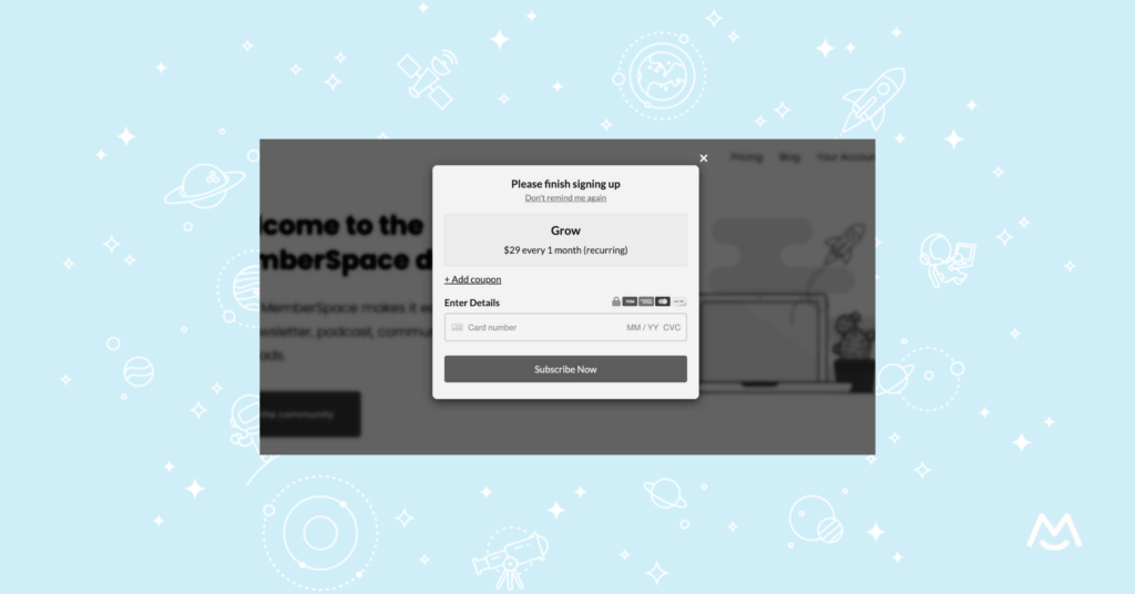
✨ Landing Page Tip: Place your CTA above the fold and throughout the page.  People scroll, skim, and sometimes get distracted mid-scroll, so give them multiple chances to say yes. 

4. Add Visuals That Show the Value

Nobody wants to read a wall of text. If someone’s thinking about signing up, help them see what they’re getting.

Include visuals that give a real sense of your product or membership. This makes everything feel more tangible and helps build trust, especially if you can show real people or real results.

Visual ideas that convert:

  • A screenshot of your membership dashboard or course platform
  • A quick video clip of you teaching or coaching
  • A behind-the-scenes shot of a community Zoom call
  • A mockup of your downloadable resources
  • A preview of your workout video, podcast, or template pack

This helps people visualize themselves using your product or being part of your community! Here’s a great example from The Co-Op membership, showcasing the founder of the membership, the member dashboard, and customizable templates that members get access to when they join. 

5. Build Trust With Social Proof

People trust people more than they trust sales copy. That’s where social proof comes in.

Whether it’s a glowing quote from a customer or a stat showing how many members you’ve helped — don’t underestimate the power of a good testimonial.

Try adding:

  • Short quotes with names and photos, if possible
  • Quick video testimonials
  • Logos of businesses you’ve worked with
  • Stats like “Over 10,000 members and counting” or “Rated 4.9 stars by 500+ customers”

Even one solid piece of social proof can tip someone from “hmm maybe later” to “okay, I’m in.”

6. Optimize With Basic SEO

You’ve built a beautiful landing page that clearly explains your offer — but now it needs to be findable on Google.

Enter: SEO. You don’t need to be an expert. Just focus on the fundamentals, like keyword research, using your target keyphrase in your headline, and adding a clear meta title and description. 

If you want more help, tools like Ahrefs, Semrush, and Moz can give you deep insights — but honestly, just knowing what your audience is searching for and naturally using those phrases goes a long way.

We’ve also created a free SEO checklist for membership sites, so be sure to use that to ensure you’re properly optimizing your landing page. 

Final Thoughts

If you’re working toward a high-converting landing page for your next launch, just remember — it doesn’t have to be perfect. Try to focus on helping people understand the value of your membership or digital product, and make it easy for them to say yes.

And if you want more tips like this delivered straight to your inbox, subscribe to The Membership Blast — our must-read membership marketing newsletter. Every other week, we’ll send you actionable growth tips and real strategies that are working right now for successful membership businesses.