Pablo Picasso once said, “Good artists borrow, great artists steal.” In other words, don’t reinvent the wheel. Membership business owners have been testing and tweaking website layouts for years. They’ve already figured out what works and what doesn’t. And through their experience, you can save time, money, and energy by drastically reducing your learning curve.
Our free membership business wireframes are designed to give you a massive head-start to getting your membership business website up and running. After downloading you should review your wireframes with your website designer, and make any tweaks or adjustments to fit your unique business needs.
What are wireframes?
Wireframes are just another way of saying blueprint. In a nutshell, wireframes are drawn-up by website designers as a way for their customers to understand and agree to the layout before they spend too much time and money designing the actual website or application. Think of wireframes like the blueprints of a house. Before you build a house an architect would show you blueprints that you agree to first. Similar to an architect, a website designer should show you wireframes before designing your new website.
Speaking of architects…

There’s an old saying in architecture, made popular by Frank Lloyd Wright . “Form follows function.” Essentially this means that function or purpose is more important than”form” (another word for design).
In addition to architecture, this philosophy is also practiced on the web. Wireframes help you focus on function (or purpose) first, and design (form) after.
While a beautiful website certainly helps, that’s not why your customers are there. They came for your content library, your private podcast, or to sign up for your newsletter. So focus on helping them do that first.
What’s included?
First and foremost, this is absolutely free. No credit card and no payment is required. Our mission is to purely help membership business owners by providing free growth, marketing, and strategy resources.
Your free wireframes include:
-
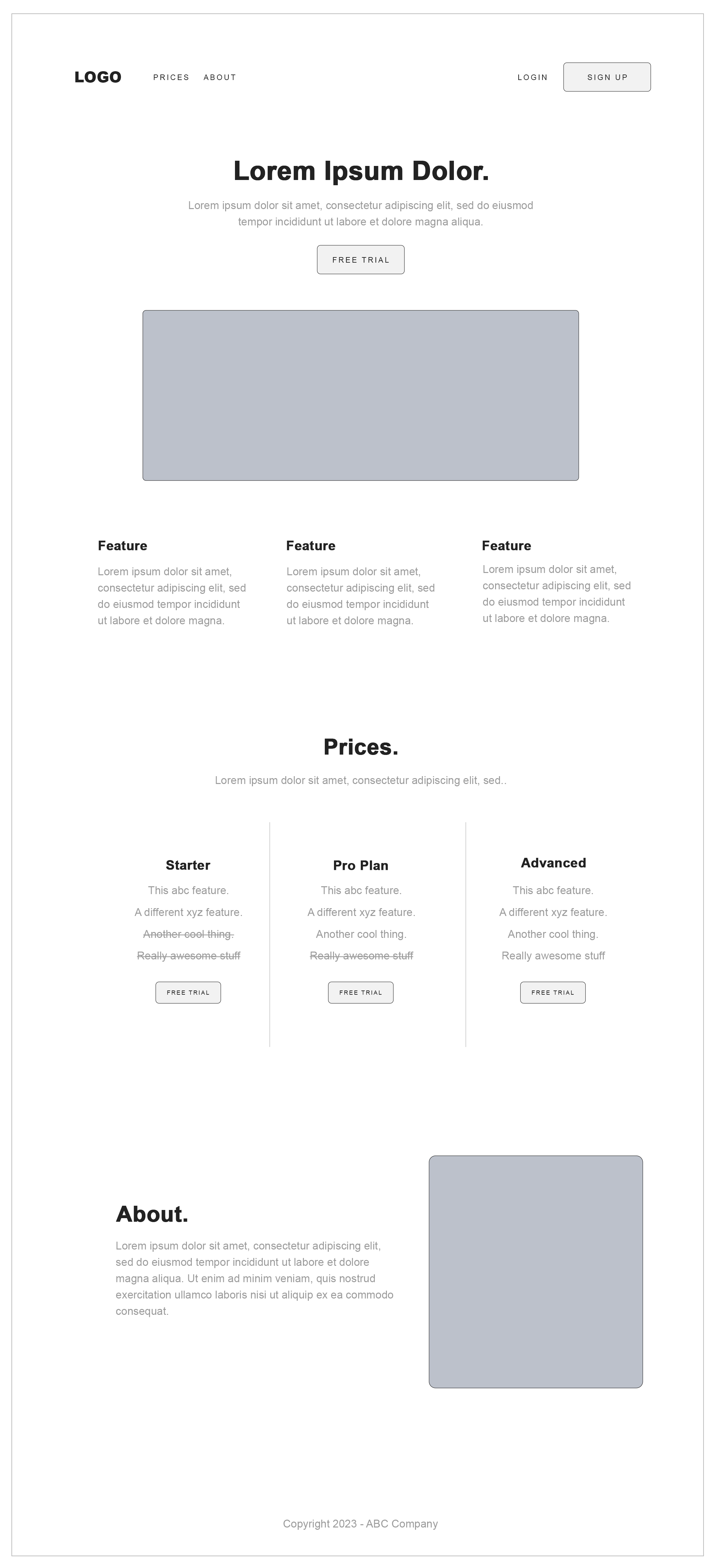
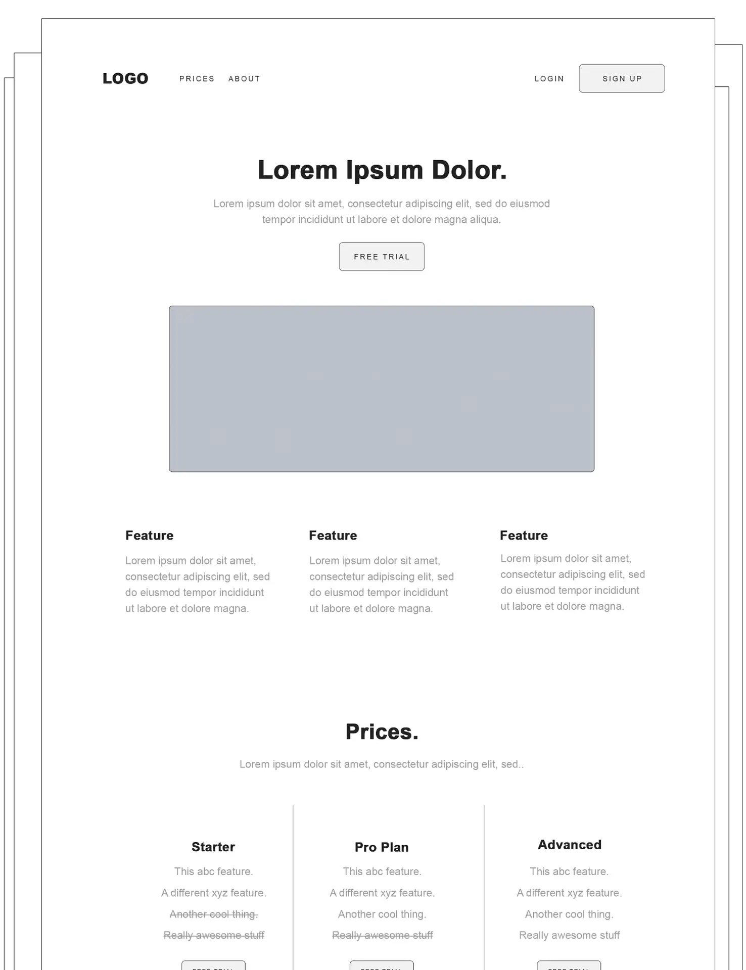
- Homepage Option 1 (See example below)
- Homepage Option 2
- Member Welcome page
- Free Plan Member’s Only Category Page
- Paid Plan Member’s Only Category Page
- Member’s Only Content Download Page
- Video Overview and Breakdown
Homepage Option 1

Homepage Option 1 Breakdown
Header
As you can see, the header menu shows your logo as well as links to your about page, pricing page, member login area, and new member signup. This is a very standard and recommended layout for every page of your marketing site including landing pages and blog articles. You always want to help your target visitors know and understand who you are, how much your membership costs, and most importantly how to easily sign up.
Heading and Description
Just below the header, you should state exactly what you do in big bold words, followed by your benefits in the description below. Some people like to reverse this; however, if you’re just getting started it’s important to state exactly what you do first, so your customers know they’re in the right place.
Main CTA Button
The above section of content should be followed by a CTA button that either tells the user to sign up now, sign up for free, or start a free trial.
Hero Image or Video
Below the CTA button, a hero image or video should be added. The hero image should visually showcase what you do, and if it’s a video, you should explain visually what you do in 30 seconds or less.
Features
Below your hero image or video, you should add a few sections that explain the top features included when signing up for a membership.
Pricing
Below features, we show an example of how a typical pricing section looks for a membership website. It’s very common to have between one and three plans, including a free plan. However, every business is different so please tailor this to your unique business.
About
The last section the homepage wireframe shows is a message from the founder to the visitor. Perhaps add a little copy, and more importantly, consider showing a short video of yourself explaining the benefits of signing up.
Download Wireframes
Download all 7 wireframes for free including a video breakdown.
How to download
We ask you to signup so we can send you more free downloads and resources; however, you can opt-out anytime.
1. Click the below download link.
2. Signup or login with an email and password.
3. Click “Free downloads” in the footer menu.
That’s it.
Wireframe FAQs
Can I make modifications to these wireframes?
Absolutely. Tweak and modify your wireframes to fit your unique business.
Can I share these wireframes?
Yes, you can share with customers if you’re an agency or freelancer. However, we ask that you not sell or re-distribute these wireframes as a free resource for your target market.
How did you make these wireframes?
I used Photoshop, but there’s a free tool out there called Balsalmiq. It’s an oldie but great tool. More advanced users can use Figma or Photoshop.
Do I need a credit card or to make a payment for these free wireframes?
No. You simply need to login to our 100% free member space for membership business owners.
How do I download these wireframes?
Create your free MemberSpace account and click “Free Downloads” in the footer. (Simply login if you are already a member)
A few final notes
Somebody once said, “perfection is the enemy of progress”. In simpler terms, get your membership business site up and running ASAP. Do not try to perfect your site now. You will be tweaking and adjusting forever. That’s the nature of website design. Trying to get your website perfect now will literally delay your progress.
In fact, consider setting a goal of two weeks, or maybe 30 days at most to get your website up and running. Stick to your goal no matter what and tweak to “perfection” later.
Best of luck to you.


