The problem with most About Me pages is that they are an afterthought or ‘check the box’ exercise, rather than a strategic and well-thought-out page that builds trust and showcases value.
When you’re building any type of online business, the importance of having a compelling About Me page cannot be underestimated. It is typically the most visited page on any website after the home page, so the content should be carefully considered and form an integral part of your overall marketing strategy.
In this article, we’ll guide you through what to include in your About Me page, provide a template example, and help you brainstorm ideas by showing you 20 great About Me pages you can draw inspiration from.
And if you need help building the rest of your website, be sure to check out our free website template below!
Download our free membership site template!
Get started with your own content library today! Download this free, ready-to-use HTML and CSS template to build a streamlined, professional membership site.
What Should an About Me Page Include
Your About Me section is a sales page designed to answer customer questions and drive conversions. So it should give visitors an accurate overview of what you do, and an insight into what working with you will be like. The key components to cover include:
1. Your Mission
What is it exactly that you do? And why should website visitors care? Establishing a mission statement helps answer both questions. You don’t need to state outright that “my mission is to….”, but having some form of mission statement is a great starting point for creating value.
2. Your Story
Whether you are just starting or already established, you have a story worth telling. Prospective clients like to know how your business was born, how it evolved, the challenges you’ve faced, how you adapted, and what your vision for the future is.
3. Your Services and Benefits
By summarizing what you offer, your values, and your unique selling proposition (USP), you can connect your services with your brand values. This helps prospects understand how your business model is different and why they should choose you over a competitor.
4. Social Proof
Reviews, case studies, and testimonials showcase your past successes and can be a powerful influence on purchasing decisions. They prove that you live up to your promises, and provide real-world evidence that other people already trust you and benefit from your services.
Tips for Writing an About Me Page
Writing an About Me page presents a unique opportunity to let prospects know exactly who you are and what you stand for. You should write in a way that is an honest reflection of you so that the customer journey from expectation to reality is seamless. Some points to consider include:
First person vs. third person – For a business website, a third person approach is more professional. For a one-man-show, personal portfolio, or blog, a first person approach is more relatable.
Wording – It’s essential you write in your own voice. Trying to impress with overly verbose terms or clever words plucked from a thesaurus defeats the object. Aim for a balance between casual and professional.
Persona – You want to come across as approachable, relatable, and engaging. But don’t force it. To allow an accurate insight into your personality, you must be 100% honest. For example, using humor can be great, but only if it comes naturally.
Images – You should include at least one image, but choose wisely. Make sure the images you use are an actual representation of you, what you do, or what you offer. Stock images just don’t cut it on About Me pages.
Length – Regardless of how much information you want to impart, few readers have an attention span of more than a few paragraphs. Try to keep your About Me copy to 300 words or less.
Links – Make the most of opportunities to tie your goals and values back to your products and services, testimonials, content library, etc., with internal links. This is a sales page, after all.
About Me Page Template Example
We’ll level with you. There’s no single winning formula for writing an About Me page because everyone has different USPs and brand values. However, this is a great template if you’re unsure where to start.
Headline
Simply using ‘About Me’ as a headline lacks impact. You need to keep it short, but also punchy and personal. Examples could include:
- I’ve built over 100 Websites. Is Yours Next?
- Making Sustainable Membership Businesses a Reality
- The Most Trusted Web Apps Expert
Introduction
Now the reader is hooked with your headline, it’s time to keep their attention with a few short sentences that add weight to your claims. Your years of experience and the value you can bring are good starting points.
Story
Give more detail about who you are and what you do. The goal is to give in-depth biographical information that showcases your personality, values, and what makes you, well, you! A common approach is to explain what you did before and why you love what you do now.
Unique Value Proposition
Give a short, clear, and transparent summary of what you bring to the table, including:
- Education and qualifications.
- Previous experiences.
- Level of experience.
- Any other relevant background information.
Accolades
Include some proof of your stated value proposition, but keep it short. Bullet points of a few brief sentences are enough. You could include:
- Statistics
- Reviews
- Testimonials
- Links to relevant case studies
Call to Action
Tell your prospects in no uncertain terms what you’d like them to do. Options include:
- Signing up for an account
- Downloading a lead magnet
- Scheduling an introductory call
- Subscribing to your newsletter
20 Best About Me Page Examples
While the formula above is helpful, there are several ways of building your About Me page to make an impact. The tactic you choose will depend on what’s most important to you. Here are our top picks for you to draw inspiration from.
1. Marie Forleo
About Me Page Tactic: Longform
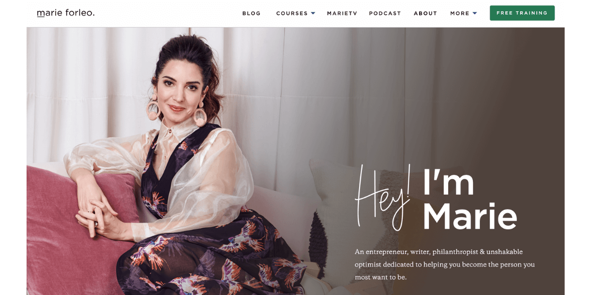
For personal brands, About Me pages that read like a long-form letter can have a powerful impact. Marie’s site reads like a mini autobiography, telling the reader everything they need to know and more.
2. Kero One
About Me Page Tactic: Audience maximization

Kero’s bio section tells his story in four different languages: English, Japanese, Korean, and Chinese. This makes it clear he cares about getting his story out to as wide an audience as possible, and that he is an inclusive brand.
3. Sara Dietschy Sara Dietschy
About Me Page Tactic: Home Page Optimization

About Me Page? What About Me page? Sara’s homepage acts as both her homepage and bio, and effectively so. After all, she is the brand. While this doesn’t work for everyone, the information and layout render an additional page unnecessary.
4. ToyFight
About Me Page Tactic: Humanization
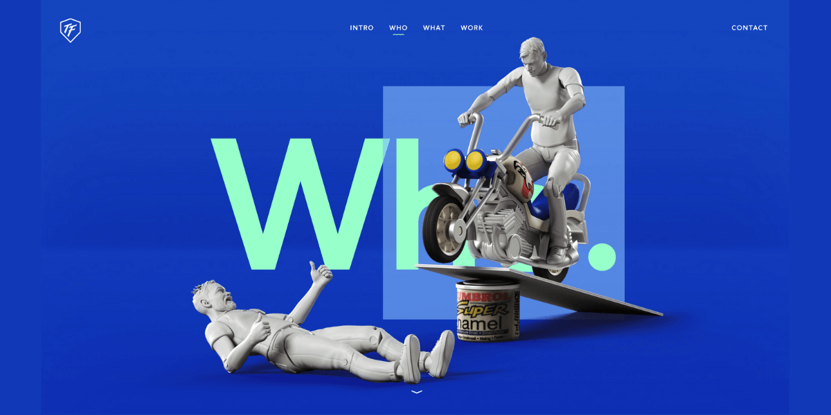
The deconstructed action figures of the founders and accompanying descriptions provide both proof of their creativity and an insight into their personal lives and minds that prospects can connect with.
5.Cookie and Kate
About Me Page Tactic: FAQs
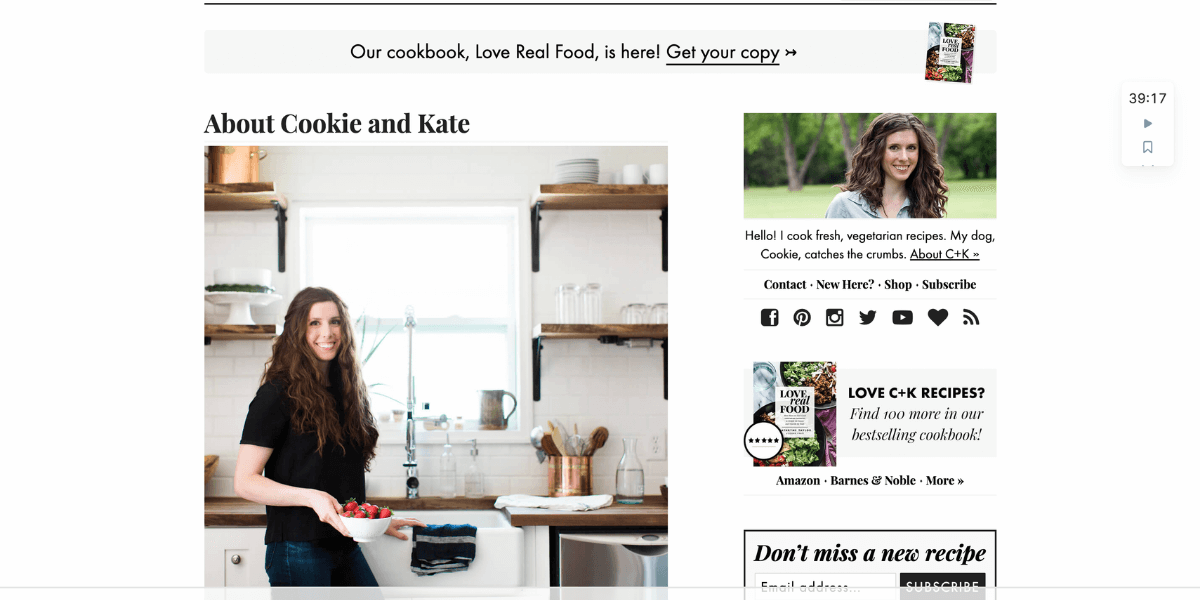
Not only does Kate’s passion for all things food shine through in her bio, but incorporating an FAQ section at the bottom of the page is a clever way of answering the main follow-up questions readers may have.
6. Oceanpark Swimwear
About Me Page Tactic: Testimonials
The brand name makes the product proposition clear, so the about page delves straight into customer accolades. Coupled with a personal introduction to the founder, Brie (and her dog!), this is a winning combination.
7. Nick Loper – Side Hustle Nation
About Me Page Tactic: Heaps of personal info
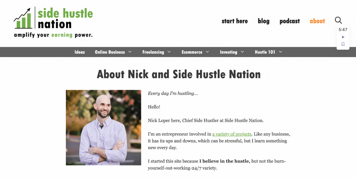
Convincing everyday people that you are also a relatable everyday person can have a big impact. Including a ‘25 random facts about Nick’ section on this About Me page is a great way to build rapport and find common ground with prospects.
8. Jared Christensen
About Me Page Tactic: Humour
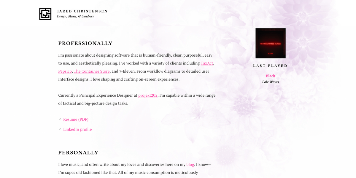
Jared’s About Me page is a fantastic example of using humor to build authenticity, value, and rapport. He uses sarcasm in a positive way that instantly makes the reader trust him and want to learn more.
9. Skinny Dipped
About Me Page Tactic: An emotional pull
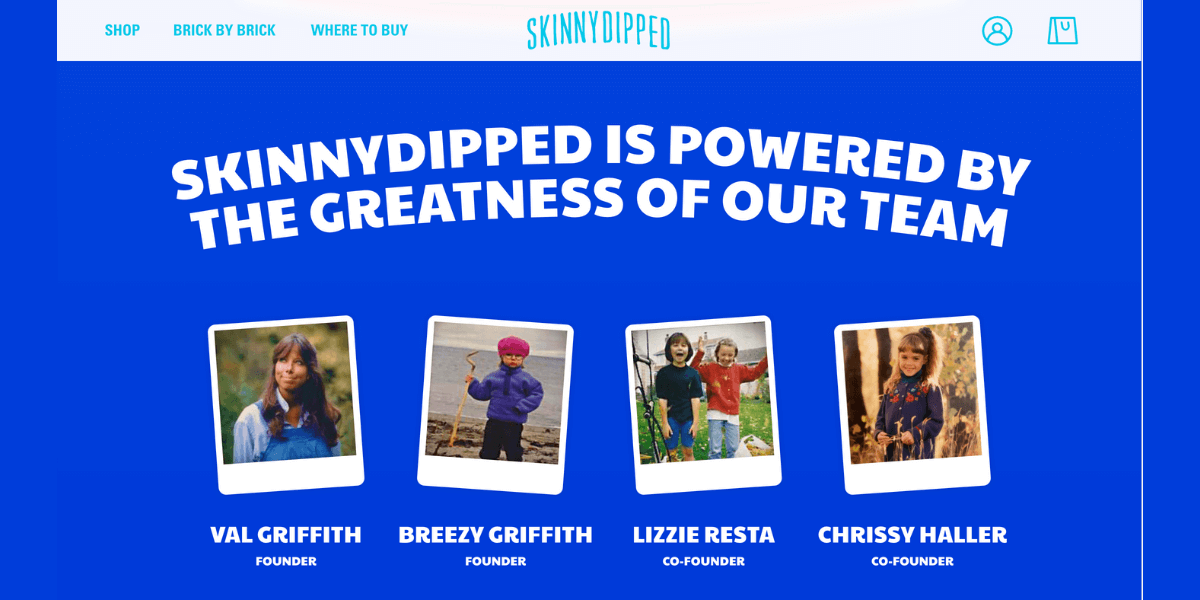
You get an instantly trustworthy vibe from Skinny Dipped. Drawing on events that inspired the birth of the business, this About Page bares honest insight into the down-to-earth values of the founders, before moving on to a hearty mission statement.
10. Josh Funk
About Me Page Tactic: The fun factor
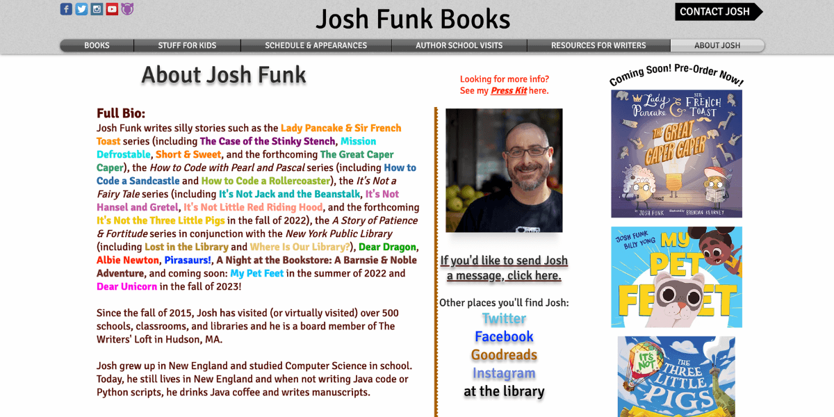
This level of quirky only works if it matches your persona and brand values. Josh pulls it off perfectly with the scattered use of colors, a mix-match of personal and professional info, and a highly entertaining and relatable bio section.
11. Nomadic Matt
About Me Page Tactic: Lead magnets
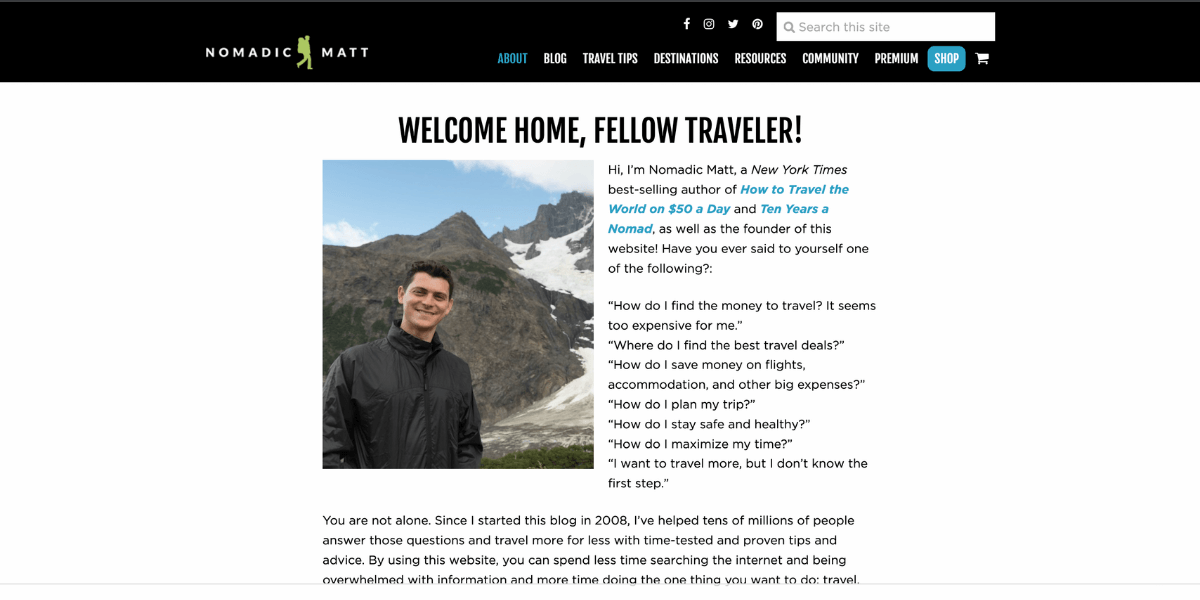
In addition to a compelling bio and an impressive list of publications in which he has been featured, Nomadic Matt actively builds his CRM by offering free planning guides and travel tips in return for providing your name and contact email.
12. Amy Porterfield
About Me Page Tactic: Personal backstory
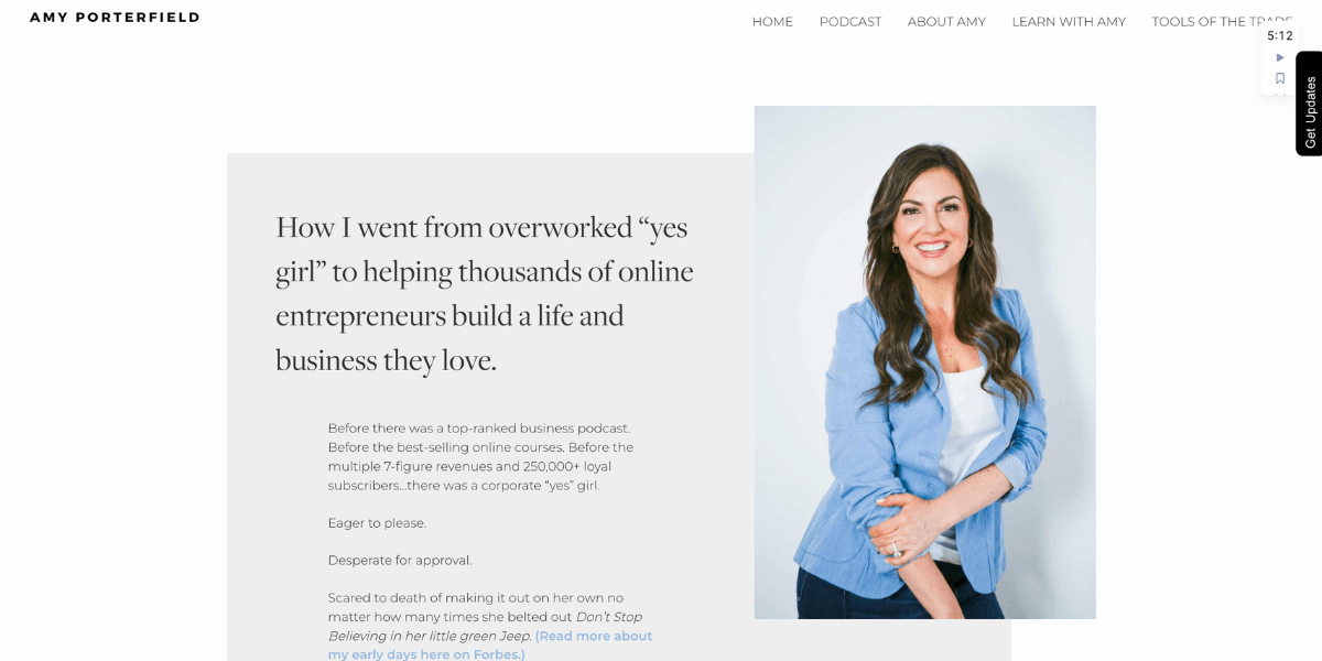
Providing a backstory that readers can connect with is a great way to build trust. Amy slinks in a number of stellar business achievements but also makes it clear she started from the bottom and tells a relatable story about her journey to success.
13. Pierre Caron
About Me Page Tactic: Honesty
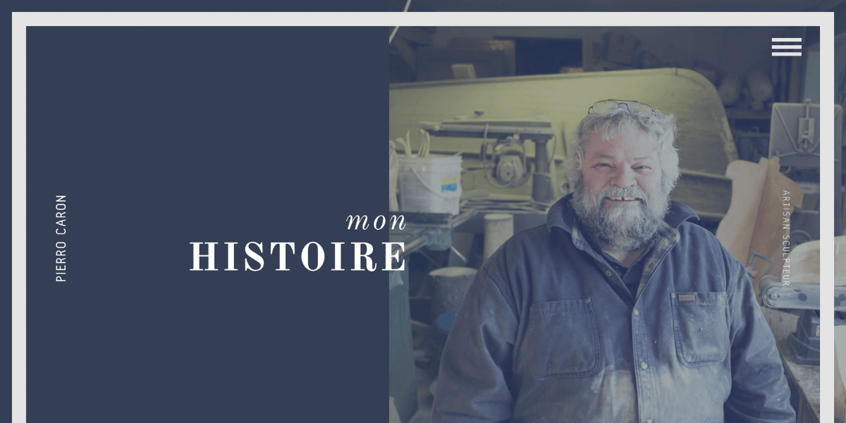
While all of the About Me pages we’ve featured so far have felt honest, there’s something about the way Pierre tells his story and conveys his love for wood and the environment that makes him instantly trustworthy, likable, and relatable.
http://poc-sculpture.com/mon-histoire
14. Nathan Collier – Collier Marketing
About Me Page Tactic: Every base covered
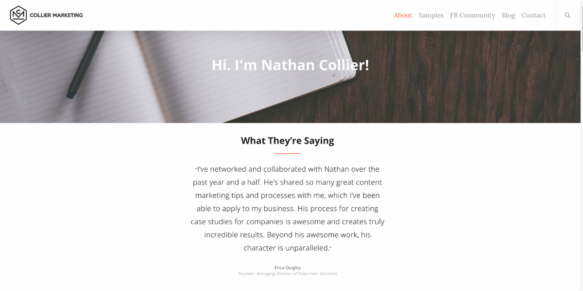
This page includes everything you could possibly want to know about Nathan and his work, but without feeling cluttered or complex. It’s hard to think of a question that isn’t answered on either the About Me page itself or one of the other linked pages.
15. Cultivated Wit
About Me Page Tactic: A bold statement

Opening with a bold statement instantly tells readers who you are and what you’re about. Of course, the rest of your content needs to back that up. Cultivated Wit pull this off with their quickly personal photos and descriptions.
16. Chubbies
About Me Page Tactic: Excellent Copywriting
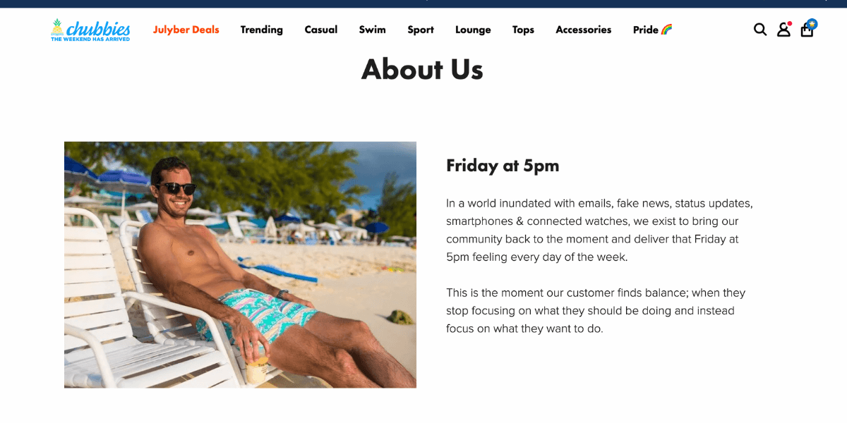
Although text-heavy, this page is expertly written to connect with the intended audience – everyday regular guys, just like the founders. The copy instills plenty of personality and makes a lasting and memorable impact.
17. Adam Dannaway
About Me Page Tactic: Relatability
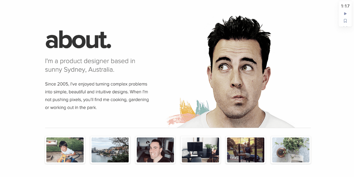
Adam knows that his field of work resonates with the nerdy crowd. So he caters to this with his mention of Pandora and Yoda in his bio, and ranks his skills on a rating scale between Newbie, Geek, Ninja, and Jedi.
18. Ghosthorses
About Me Page Tactic: Simplicity
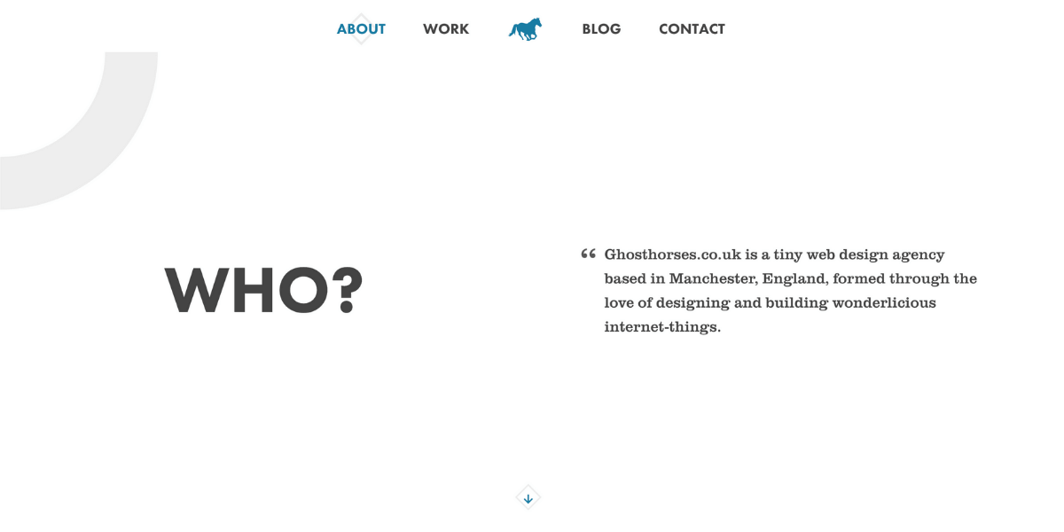
In the space of four short sections, you get a feel for exactly what the company does in simple terms. The relatable style of writing is mirrored throughout the rest of the website, leaving the reader in no doubt about what to expect from doing business with them.
19. Johanne Lian Olsen
About Me Page Tactic: Compacted resume

What better way to demonstrate your skills and experience than giving people your resume? Ditching all the visuals is a risky move, but everything about Johanne’s education, work history, and achievements are right there, front and center.
http://www.lianolsen.com/about-1
20. gummisig
About Me Page Tactic: A unique approach

gummisig’s About Me page breaks a lot of traditions. His bio transitions from third to first person, and he chose a quirky overhead picture of himself rather than the standard professional headshot. The overall result is compelling and memorable.
We hope we’ve given you some great ideas and inspiration! Nailing your About Me page is an essential step in attracting members.
Thinking about selling exclusive content on your website? Check out MemberSpace University, your one-stop resource hub full of tips, tricks, step-by-step guides, educational videos, and more for marketing and selling digital products and memberships with MemberSpace.
Download our free membership site template!
Get started with your own content library today! Download this free, ready-to-use HTML and CSS template to build a streamlined, professional membership site.


